
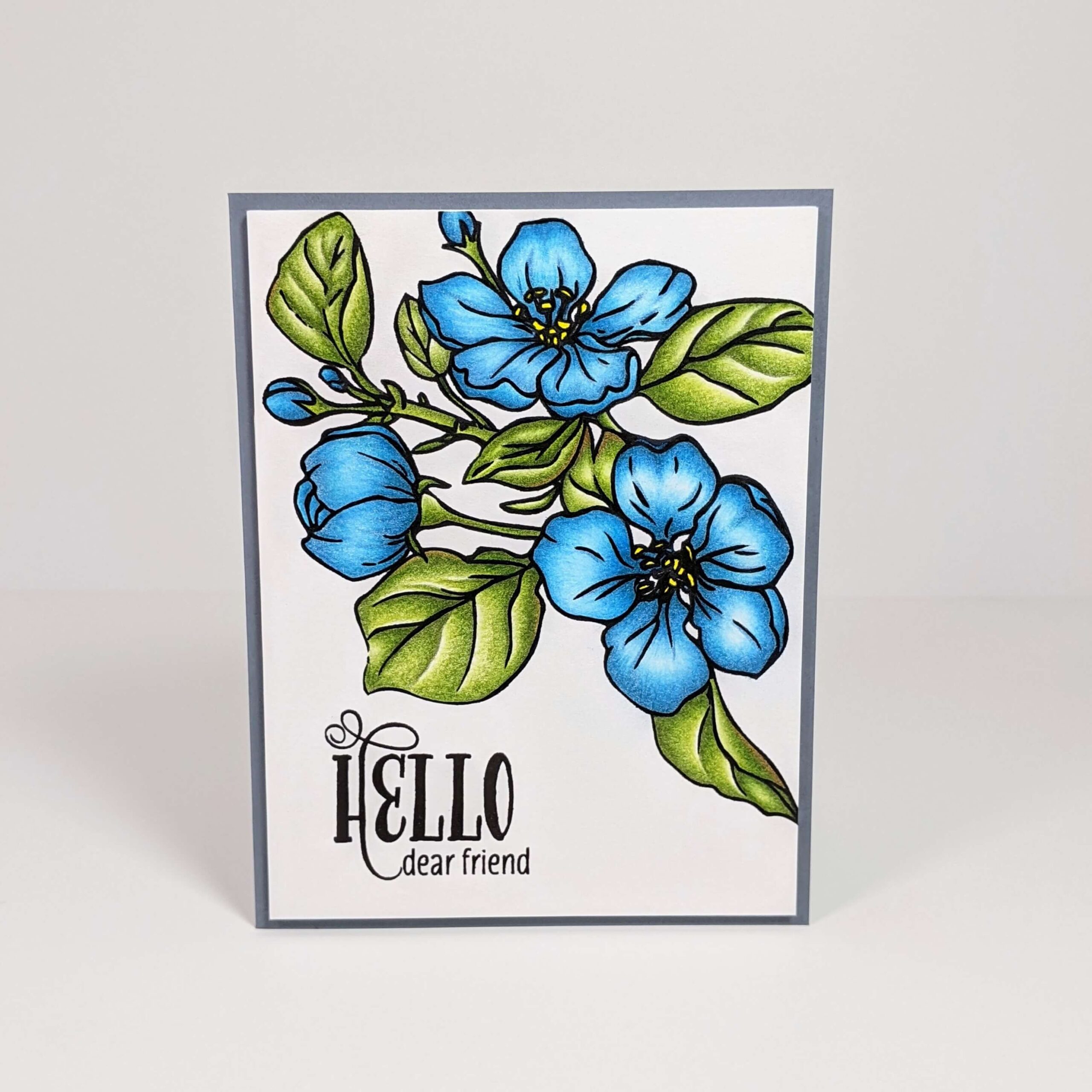
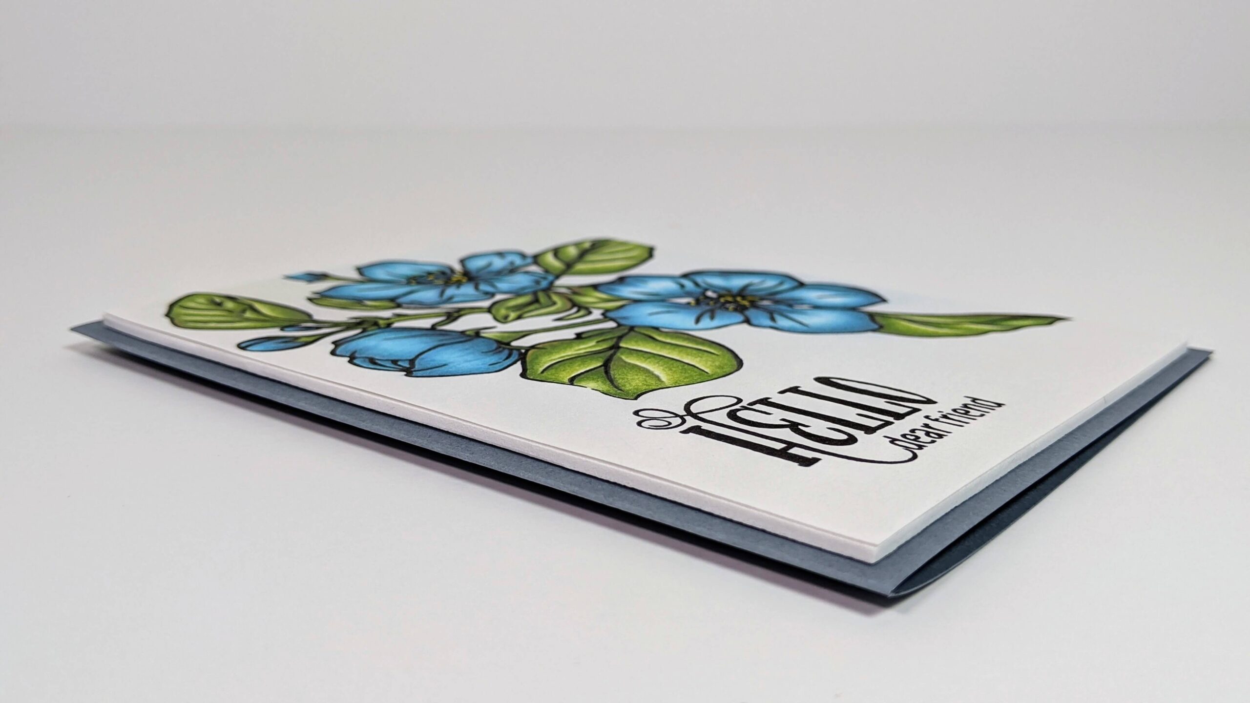
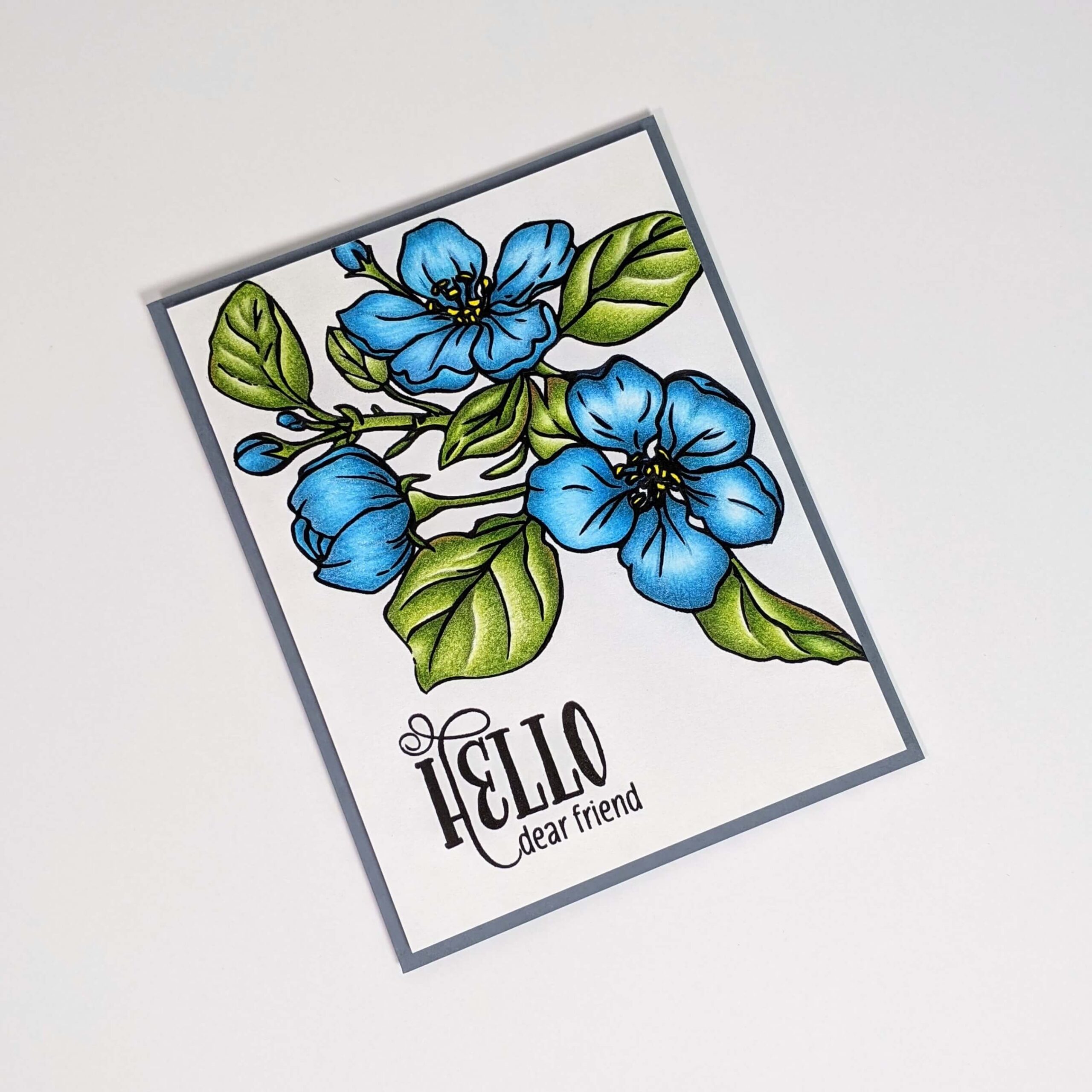
Colored pencil blending is a technique that can be pretty simple if you know the basics. I recently made this card using colored pencil blending, so I thought I’d walk through how I did it and call out some helpful pointers that helped steer me when I was first learning. Keep reading to find out how you can color your own masterpiece too.
I’ve also included the supplies I used. Check them out and let me know if you have any questions! 💙
Materials Used:
This blog may use affiliate links when they’re available. If you choose to make a purchase through one of these links, I may receive a small commission at no cost to you. I don’t make recommendations lightly, and will only link to products I know and trust.
- Sakura Pigma 05 Micron Blister Card Ink Pen Set [Amazon]
- Faber-Castell Polychromos Colored Pencil Set – 60 Pieces [Amazon]
- Faber-Castell Polychromos Colored Pencil Set – 120 Pieces [Amazon]
- Colors used in this design: White (101), Light Cobalt Turquoise (154), Cobalt Green (156), Cobalt Turquoise (153), May Green (170), Earth Green Yellowish (168), Permanent Green Olive (167)
- EK Tools EK Scoring Board 12×12 [Amazon]
- Fiskars Recycled Bypass Trimmer, 12 Inch [Amazon]
- Misti Stamp Tool Original Size Stamp Positioner [Amazon]
- Ranger Archival Ink Pad, Jet Black [Scrapbook.com] [Amazon]
- All Year Cheer Stamp Set – WPlus9 Design Studio
- Recollections Cardstock Paper, Essentials 20 Colors [Amazon]
- Strathmore Colored Pencil Paper Pad 400 Series [Amazon] [Blick]
- White Foam Sheets – Time 4 Crafts [Amazon]
- Forever In Time 3D Pop Dots Square Dual-Adhesive Foam Mount, 1/2-Inch [Scrapbook.com] [Amazon]
Colored Pencil Blending Tutorial:
Step 1. Start with a simple image.
If you’re new to using this colored pencil blending technique, I would suggest starting with a fairly simple image. This would ideally be something small that doesn’t have a lot of detail. A small flower, a basic rainbow picture, or anything like that will allow you to practice getting your shading and blending right. Once you’ve mastered that, move over to something more complicated or detailed.
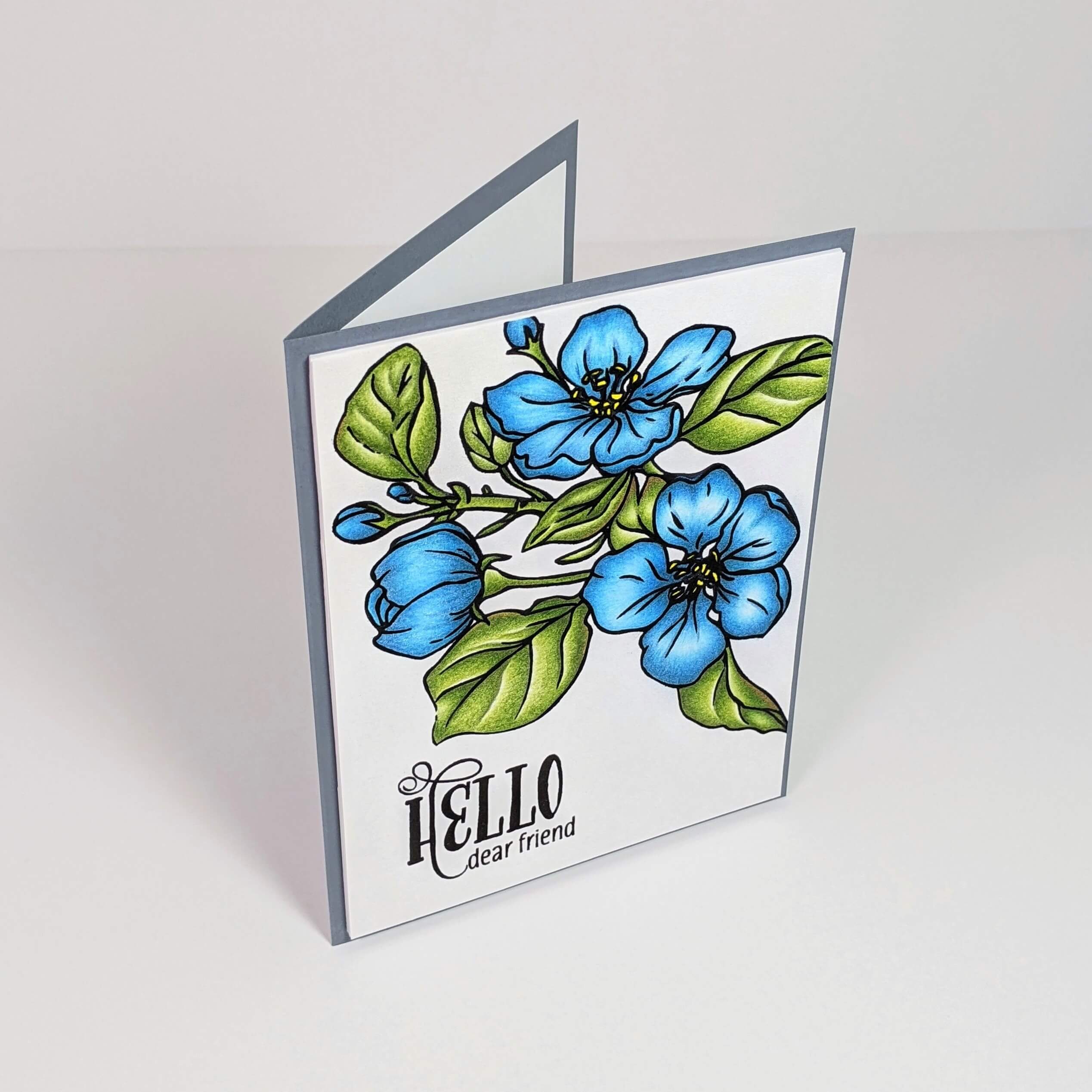
For example, I started with the flower petals on this image because I knew that was the easiest part of the project. Once I mastered the flower petals, I moved to the more detailed leaves.
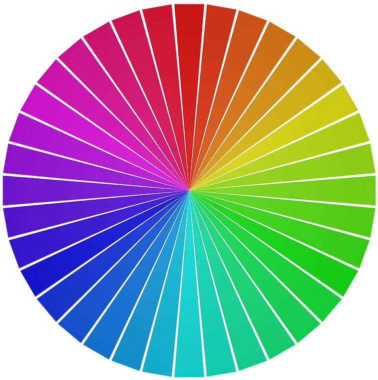
Step 2. Blend colors that are near each other in the color wheel.
The general rule of colored pencil blending (or any blending, really) is that if you try to blend two colors that are near each other in the color wheel, you will get a nice easy transition from one color to the next.
Take a look at the sample color wheel below. If I were to take a purple colored pencil and try to blend with a pink pencil, I would likely get a lovely magenta in the middle where the two colored pencils overlapped. This works because pink and purple are near each other on the color wheel. Colors that are next to each other are known as analogous colors. It is typically easier to blend them because of their likeness. Adversely, if I try to blend two colors that are across from each other like Blue and Orange, I would end up with a brownish color. Blue and Orange are complementary colors that cancel each other out.
In the card I made, I used Light Cobalt Turquoise (154), Cobalt Green (156), and Cobalt Turquoise (153) to make the flower petals. You will notice that the turquoise colors are near each other on the color wheel making them easier to blend. The leaves were colored using May Green (170), Earth Green Yellowish (168), and Permanent Green Olive (167).
Step 3. Consider the shape of the item and where the light would hit it.
Lighting is such an important part of creating depth. Think about where the light will hit your design, then use your colored pencil blending to match the lighting to create that depth. When looking at a flower petal in real life, it’s not flat, it’s rounded. As a flower opens up, it curls back. When the light hits it, the middle of the petal would likely be the best lit area, and would therefore be the lightest color. The outside edges of the petal would be darkest. The base of the petal would also be darker since the pistil (area holding the pollen) is taller and is casting a shadow.
The direction of the light can change, but again, let’s keep it simple for now.
Step 4. Start with the darkest color first.
When I’m colored pencil blending, I find it’s easier to color the areas where I want the shadow to be before I color the areas that would be well lit. Therefore, I typically start with my darker colors first using very light layers.
For these flowers, I used Cobalt Turquoise (153) near the edges of my flower petals and at the base. Then I moved to my mid-tone color which was Cobalt Green (156). Lastly, I used Light Cobalt Turquoise (154) Near the middle of my flower petal where the coloring would be the lightest.
Step 5. Apply your colored pencil blending in layers.
You really want to blend your colored pencil design in layers. Coloring in layers can help two similar colors blend seamlessly. Let’s look at the two layers below and discuss what works, and what doesn’t.
The first image shows what the various layers on your picture can look like as you move through the process of colored pencil blending. The first layer is very light, and it honestly doesn’t look very good. But remember, that’s normal because we’re not done. You may not even like the second layer, but don’t give up! Colored pencil blending is a process, and by the last layer, it will look much better. I typically do 3 or 4 layers depending on the color I use and the picture I’m working on.
")

The second picture shows you what happens when you use the layering technique (Top Line) vs. when you don’t use layers to blend (Bottom Line). You will notice that the top example, where I used layers to achieve the blend, has a really smooth transition between the lighter color and the darker color. It’s hard to see where one color ends and the next begins. You have to really look closely to see any imperfections. The bottom, however, has a very distinct line where one color ends and the next begins because I applied too much color before attempting to blend.
Step 6. Have fun with it!
No matter how your coloring turns out, just have fun with it, and remember that art is about expressing yourself in your work. Don’t compare your work to anyone else’s, and don’t try to make it perfect. there is no such thing.
If you’re looking for even more practice, you can get a deeper dive into the world of colored pencil blending by checking out free tutorials from Kit and Clowder! I have learned so many tips and tricks for colored pencil blending from her, and she offers several free classes!
I hope you found this tutorial helpful. If you’re looking for more colored pencil tutorials from me, please find them here. Also, don’t forget to follow me on Instagram, Facebook, or Pinterest for the latest updates! You can also shop all the handmade cards that I’ve designed here.