
Are you looking to begin your journey as a watercolor artist but you’re feeling overwhelmed by all the paints out there? Well, don’t worry. It can be easy to get started with just a few colors. Today I’m going to show you the colors I keep in my watercolor palette, how I picked the colors that work best for me, and how to get started using a limited watercolor palette.
Watch the What’s in My Watercolor Palette? YouTube video here.
Materials Used:
This blog may use affiliate links when they’re available. If you choose to make a purchase through one of these links, I may receive a small commission at no cost to you. I don’t make recommendations lightly, and will only link to products I know and trust.
- Hansa Yellow Light 5 ml – Daniel Smith Extra Fine Watercolor [Blick]
- New Gamboge 5 ml – Daniel Smith Extra Fine Watercolor [Blick]
- Quinacridone Rose 5 ml – Daniel Smith Extra Fine Watercolor [Blick]
- Pyrrol Orange 5 ml – Daniel Smith Extra Fine Watercolor [Blick]
- Phthalo Blue Green Shade 5 ml – Daniel Smith Extra Fine Watercolor [Blick]
- French Ultramarine 5 ml – Daniel Smith Extra Fine Watercolor [Blick]
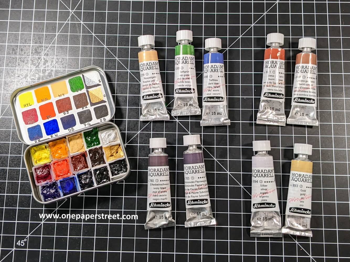
- Naples Yellow 15 ml Schmincke Horadam Aquarell Artist Watercolor [Blick]
- Sap Green 15 ml Schmincke Horadam Aquarell Artist Watercolor [Blick]
- Burnt Sienna 15 ml Schmincke Horadam Aquarell Artist Watercolor [Blick]
- Burnt Umber 15 ml Schmincke Horadam Aquarell Artist Watercolor [Blick]
- Dark Blue Indigo 15 ml Schmincke Horadam Aquarell Artist Watercolor [Blick]
- Ivory Black 15 ml Schmincke Horadam Aquarell Artist Watercolor [Blick]
- Schmincke Payne’s Grey 15 ml Schmincke Horadam Aquarell Artist Watercolor [Blick]
- Silver 15 ml Schmincke Horadam Aquarell Artist Watercolor [Blick]
- Gold 15 ml Schmincke Horadam Aquarell Artist Watercolor [Blick]
- Nomad Palette, Medium – American Journey [Cheap Joes Art]
- Empty Half Pans, 12 per pack – American Journey [Cheal Joes Art]
- 140 Colour Dot Card, Schmincke Horadam Aquarell Artist Watercolor [Amazon]
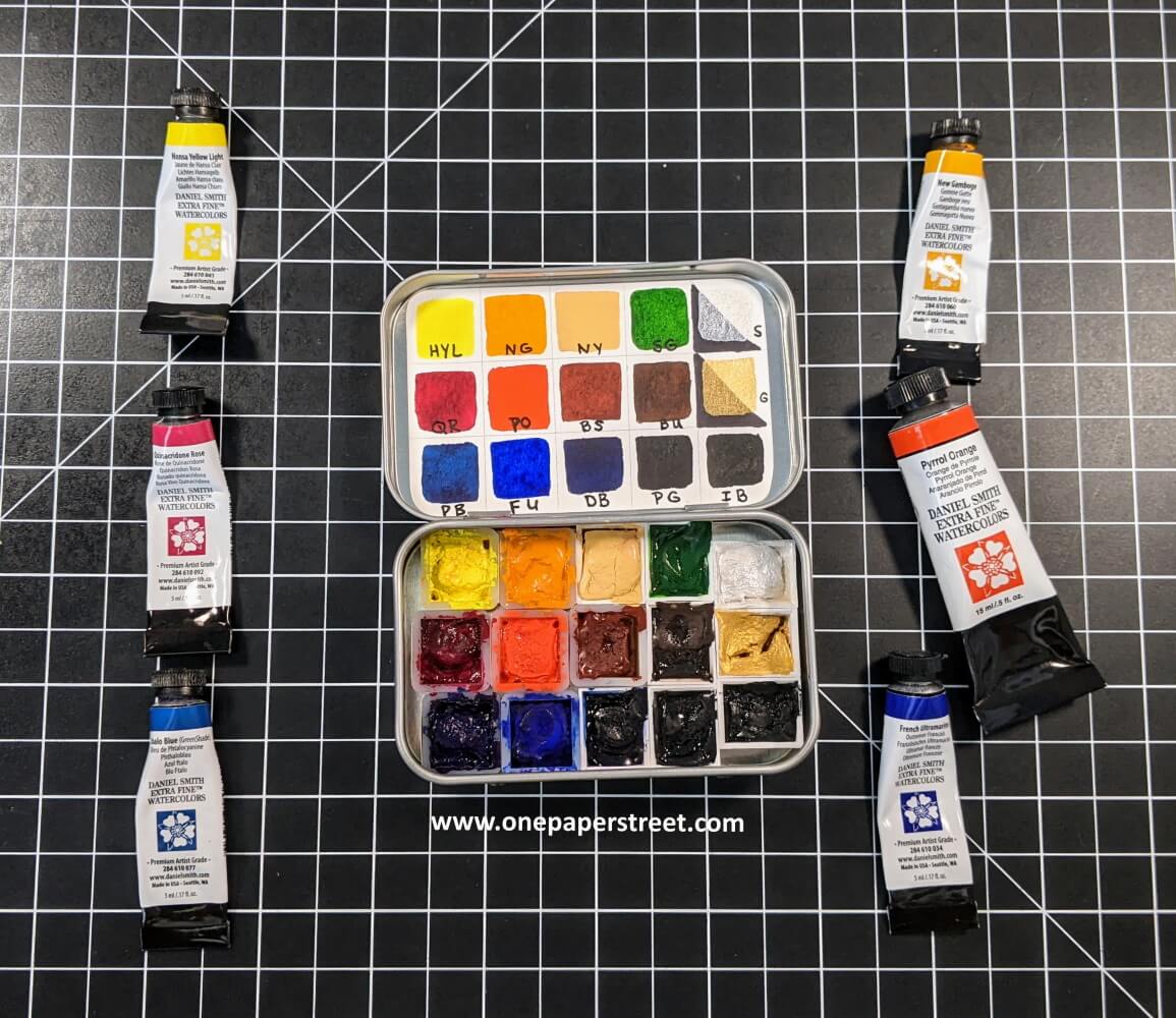
Before I discuss the colors in my watercolor palette, I’d like to talk about its size. I keep a pretty limited palette. There are only 15 colors in my watercolor palette, and (as of this post) these are all of the professional-grade watercolors that I own.
I keep a limited watercolor palette for a few reasons:
I like to paint in different places, and don’t always want to stay in my craft room. Sometimes I feel inspired by being in a different room, or sometimes I prefer to be outside in my backyard. I might also take my paints to a park or something. So, I wanted to have a versatile small palette that I can pop in my bag and just go!
The second reason I don’t own many paints is because I just don’t have a lot of space in my craft room. I wouldn’t be able to store the extra paint tubes, so I just try to buy what I need. And lastly, I find that keeping a limited palette and mixing the colors often helps me to create a harmonious (similar tone) look within my paintings.
My Primary Colors
My Primary Colors:
Cool Primary Colors
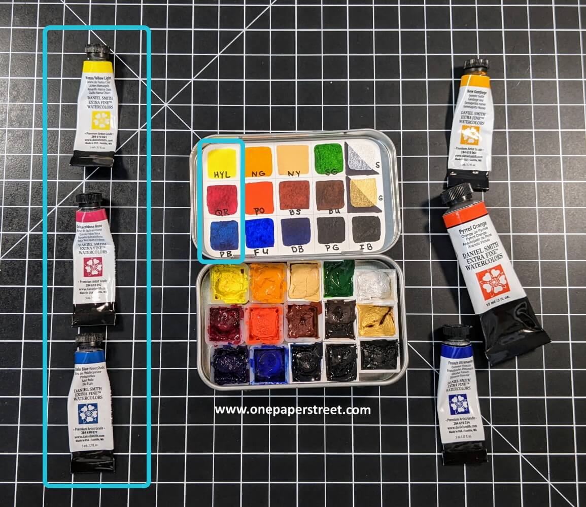
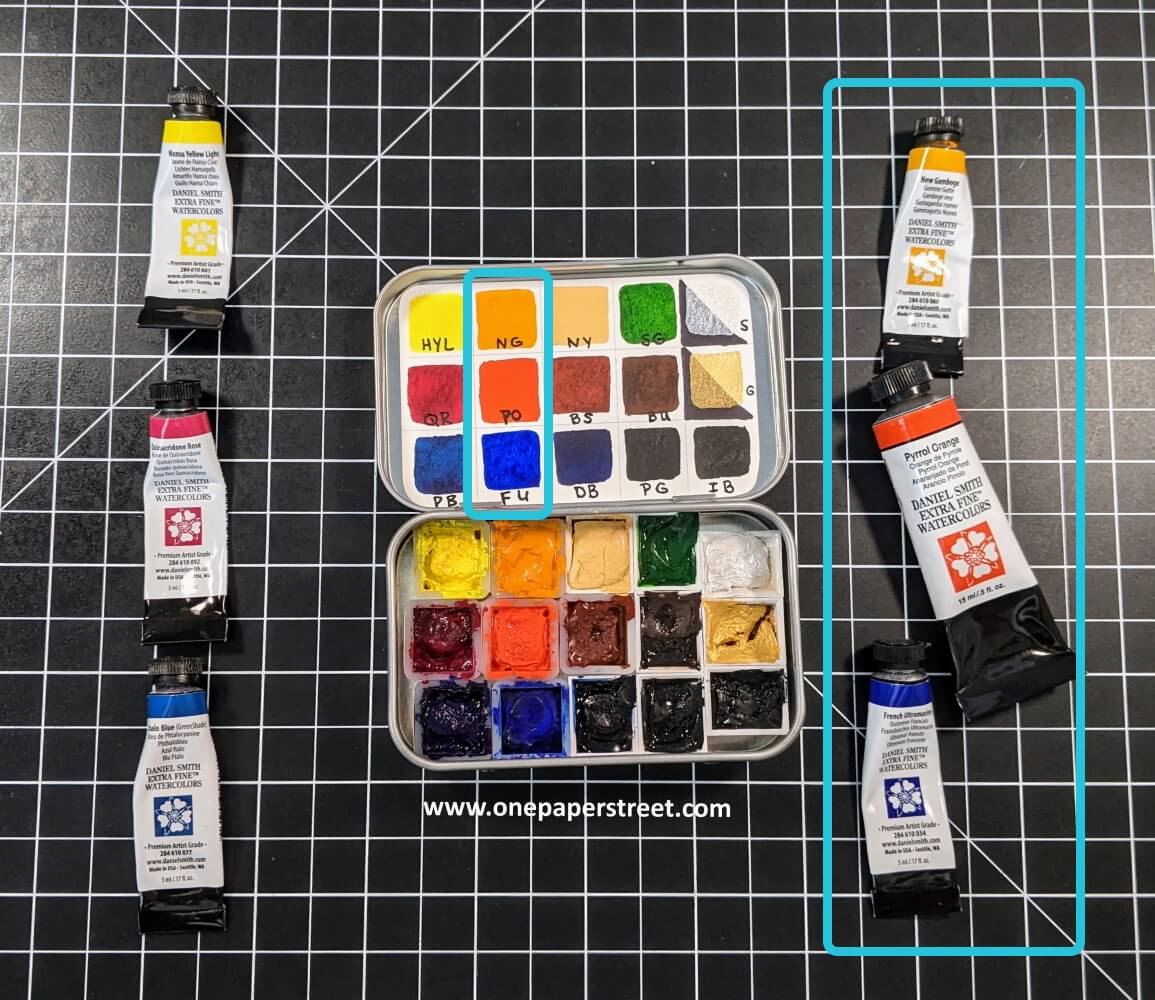
As I mentioned, I have 15 colors in my watercolor palette. But 6 of these colors are considered primary colors. Primary colors are commonly known as your basic yellow, red, and blue. The idea is that you can mix two of these primary colors in equal parts to get a secondary color. For example, mixing blue and red together will give you purple. Blue and red are the primary colors, therefore purple would be the secondary color.
Now you might be thinking “wait a minute… you said you had 6 primary colors”. Well, that’s correct! I have yellow, red, and blue in both cool and warm tones.
Warm Primary Colors
Cool vs. Warm Colors:
As mentioned above, colors can have a warm or a cool tone to them. This is true of all colors around us, not just paints. A warm color holds more yellows, reds, and orange undertones in it. Conversely, a cool color would hold more greens, blues, and indigo undertones. It’s important to have a set of primary colors in both cool and warm tones because it can greatly impact what your secondary color looks like during the color mixing process.
I use Daniel Smith extra fine watercolors as my primary tones, but the colors and the exact tones can vary from brand to brand. The cool tones that I keep I’m my watercolor palette are Hansa Yellow Light, Quinacridone Rose, and Phthalo Blue Green Shade. The warm primary colors that I use are New Gamboge, Pyrrol Orange, and French Ultramarine.
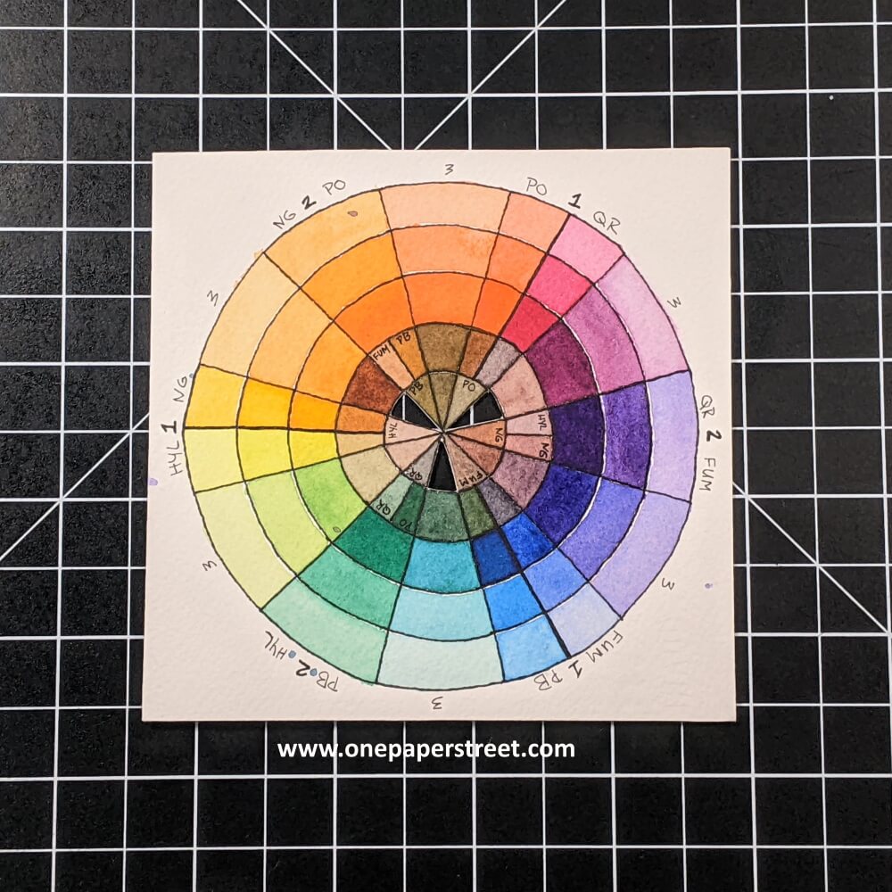
Primary Color Wheel:
These six individual colors, and all the colors that I can make from mixing them give me a wide range of options. Here are what these colors would look like on my color wheel. If you’re not familiar with the color wheel, it shows the primary colors and which colors can be mixed to create the full range of colors. I made the color wheel shown here a while ago when I was first getting started with watercolor painting.
Difficult to Mix & Shimmery Colors
Difficult to Mix Colors:
Aside from the primary colors in my watercolor palette, I keep some other colors in my watercolor palette that are more difficult to mix. I love to paint landscapes, so you’ll notice that the other colors I’ve added to my palette work very well for landscapes.
Naples Yellow is a color that isn’t on the color wheel and is slightly opaque, so I chose to buy that instead of trying to mix it. Sap Green is a more natural green for landscapes and nature scenes. I use it all the time. Since I would have had to mix both blues and my cool yellow to make Sap Green, it was another color that was easier for me to buy. Dark Blue is almost a navy blue color. This is another color not present on the color wheel, and I had trouble mixing it consistently, so I decided to purchase this paint as well.
I also purchased Burnt Sienna and Burnt Umber. These are two colors that are great for painting woodgrain or dirt. I also bought two blacks because, well you guessed it, I wanted a cool black and a warm black. Schmincke Payne’s Grey is my cool black, and Ivory Black is the warm black.
Shimmery Colors
Shimmery Colors:
Lastly, I purchased two shimmery colors Silver and Gold. They are great because they have a subtle glittery look to them. So I can mix them with the other colors in my watercolor palette to add a little bit of pop. Then I get a fun shimmery sap green or shimmery quinacridone rose, etc. It ends up looking really cool in paintings.
Using a Dot Card:
I hope this article has helped you think about what colors may be right for you. Always think about what types of things you like to paint, and what colors you would need to create those paintings, then purchase your colors based on your needs. For example, the colors I would need to paint portraits would likely be different that the colors I would need to landscape paintings.
And remember, if you can’t decide on what colors you think you may need, you can always buy a dot card. A dot card has a tiny dot from each color in that paint line. You can wet the paint, and create a small swatch to see each color for yourself. Once you’ve done this, you would have a much better sense of what paints best suit your style.
Looking for more helpful art lessons and tutorials? Follow me on Instagram, or Pinterest for the latest updates!! You can also shop all the handmade cards that I’ve designed here.